
An exclusive at The Auteurs, this is the superb new poster for the long-awaited new Aaron Katz feature which will have its world premiere at SXSW on March 13. Katz made a name for himself with his first two features Dance Party, USA and Quiet City (which premiered three years ago at South By). Lumped in with the mumblecore phenomenon of the time, his films are micro-budgeted gems in which people meet, talk and stumble through life much as they do in the films of Bujalski and Swanberg. But what set Katz’s films apart was his lyrical cinematography which took time to aim the camera away from the chattering classes to contemplate Brooklyn skylines or the wind in the trees, and led to the Austin Chronicle calling Quiet City “a Terrence Malick film for the new lost generation.” (Its influence can surely be felt in Bradley Rust Gray’s upcoming The Exploding Girl.)
Cold Weather is set and filmed in Katz’s home town of Portland, Oregon. It centers on a former forensic science major and avid reader of detective fiction (Quiet City’s Cris Lankenau) who leaves Chicago for Portland and becomes embroiled in a mystery. Its poster is designed by Marc Ripper who has designed the posters for all of Katz’s films so far (though special mention should also be made of Scott Meola’s lovely work on the Benten DVD release of the first two films). The earlier posters can be seen at the bottom of the page.
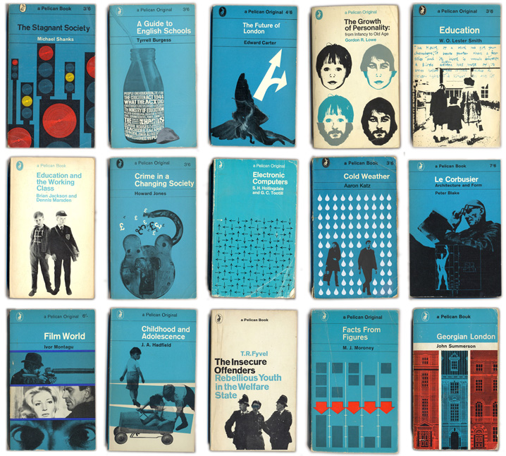
The design of the Cold Weather poster is greatly influenced by the Penguin paperback covers of the 1960s, of which both Katz and Ripper, like myself, are big fans. Founded in the UK in 1935 to bring quality literature to the masses, Penguin always had a distinctive and standardized look with their bands of orange and black sans serif type. In 1961 that look was revolutionized by art director Germano Facetti and designer Romek Marber who came up with what became known as the Marber Grid which separated type and illustration within a series of horizontal rules. Ripper’s design, however, is no slavish imitation. For one thing, his italic serif title treatment is completely different from the Intertype Standard or Helvetica used on most Penguin covers of the era. Also, given the crime fiction theme of the film, the obvious choice would be to pay homage to Penguin Crime, the covers of which are green and feature mostly illustration, but Ripper’s design looks much more like Penguin’s sister non-fiction line Pelican. Pelicans sported no-nonsense titles such as The Stagnant Society, The Menstrual Cycle, Adolescent Boys of East London, The Strange Case of Pot, and The Rise of the Meritocracy. In the 1960s and early 70s they used a palette of light blue, black and white and often mixed graphic symbolism, grid systems and posterized photography much as Ripper does so brilliantly here. You can see a selection below, and I took the liberty of adapting the poster to the Pelican style to show how well it fits in (and stands out).

Ripper’s portfolio (his photography is also excellent) can be seen here and the tantalizing trailer for Cold Weather can be watched here. Special thanks to things magazine (a design magazine started by the Victoria & Albert Museum and now an independent online resource) whose Pelican Project is an invaluable archive.
